
Unpacking Investment Performance Metrics: Beyond the Sharpe Ratio
Performance metrics to compare & evaluate your investment strategies

Hey there, fellow investors! Ever heard of the Sharpe Ratio? If you've dabbled in stock investment, it's probably come across your radar. But guess what? That’s just the tip of the iceberg. I've been diving deep into QuantMage’s performance metrics lately, and let’s just say, it’s been quite the eye-opener.

Sharpe Ratio: Not Perfect, But Handy
Sharpe Ratio is like that old, reliable friend in the world of investment. It’s all about sizing up risk-adjusted returns. But here’s the kicker – it measures risk using volatility, or the standard deviation of returns. Not everyone's a fan of this method, though. Before we get into that debate, let’s touch on another important bit: the type of returns used in its calculation. While simple returns (those percentage returns) are common, log returns have a certain mathematical elegance (as mentioned in this answer) in a similar way that geometric mean should be preferred over arithmetic mean when we’re talking about investing. However, since tools like QuantStats often stick to simple returns (as demostrated by the use of pct_change() here), QuantMage follows suit.
When Volatility Isn’t the Villain
Now, about that volatility debate. Some folks argue that it's not the best yardstick for risk, especially since we often welcome positive volatility with open arms. Enter the Sortino Ratio. It’s Sharpe’s cousin with a twist – it only frets over downside volatility. Then there's the MAR Ratio, which focuses on maximum drawdowns as a measure of risk. For a while, I was team MAR finding it more intuitive, till I stumbled upon this enlightening piece titled “We Measure What We Can.” It turns out, volatility is systematically predictable, unlike max drawdowns. In other words, realized historical volatility is often a decent proxy for the true volatility one should have expected in advance. And predictability is a big deal in the investing game. So maybe Sharpe and its volatility-focused approach deserve more credit.
The Emotional Rollercoaster of Returns
But here's a catch – Sharpe doesn’t factor in the journey, the ups and downs, that investors ride through. For instance, three investment strategies with the same set of returns, just shuffled around, will have identical Sharpe Ratios:
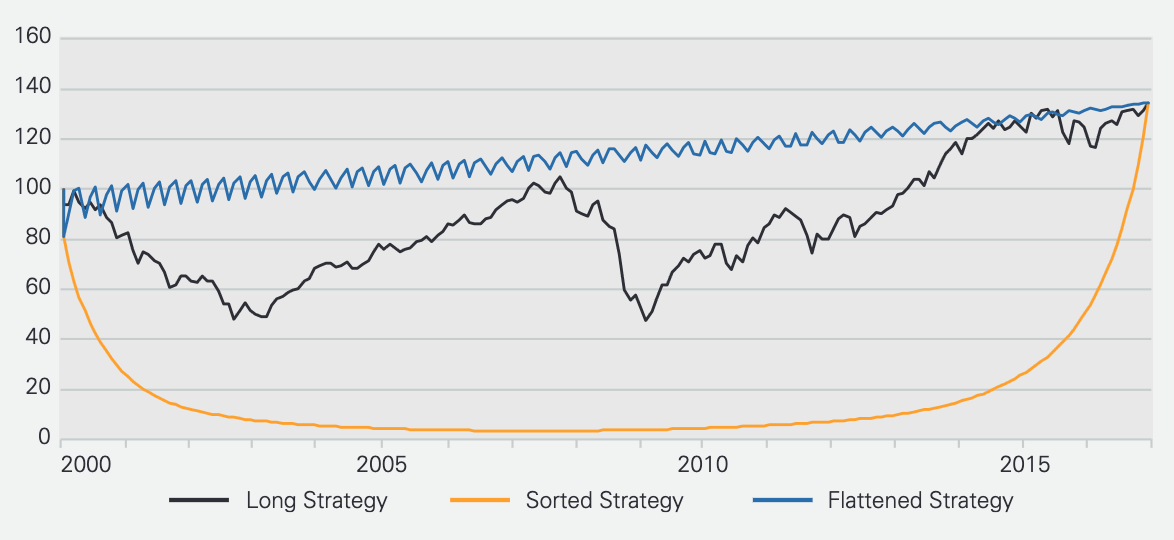
But the emotional experience? Worlds apart. That’s where the Ulcer Performance Index (UPI) steps in. It uses the Ulcer Index as its risk measure, focusing on both the depth and duration of being in the red. It’s like giving a voice to those nail-biting periods of your investment journey.
The Quest for the Perfect Metric
There’s a fascinating white paper, from which the chart above originates. It further digs into the Ulcer Index's limitations, especially around tail events. It proposes the Serenity Ratio, which adds a penalty for extreme risks. But then, the subsequent paper points out its predictability issues (in a similar way that the max drawdown lacks predictability), leading to the Smart Sharpe Ratio as a proxy for the purpose of portfolio allocation optimization. This new variation of Sharpe penalizes autocorrelation in addition to volatility. In simpler terms, the autocorrelation is about how returns tend to cluster together – like in our shuffled return sequence example above. The Sorted Strategy will have a higher autocorrelation than the Flattened one.
At QuantMage, we’re currently dishing out Sharpe, Sortino, MAR, UPI, and some other cool metrics like Keller Ratio, Gain-to-Pain Ratio, and Win Rate. Each offers a unique lens to view your investment performance.
So, what’s your go-to metric? Why do you swear by it? Or is there something you think we’re missing?